


Our Responsive Web Design service guarantees that your website will look and perform perfectly on any device. With the growing number of mobile users, having a responsive website is crucial for retaining visitors and reducing bounce rates. We ensure your site adapts smoothly to different screen sizes, with fast load times and intuitive navigation on all devices. This service is essential for improving your site’s user experience and boosting your SEO rankings on mobile searches.
Please Login to leave a review.
")
 (1)")
")
 (1)")
 (1)")
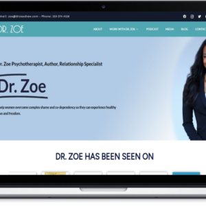
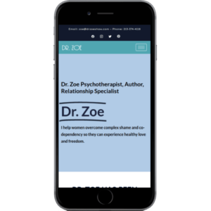
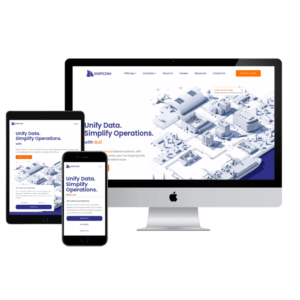
Responsive Web Design for All Devices
Ask you price
Seamless website performance across all devices, ensuring optimal user experience on mobile, tablet, and desktop.
🔥 3 items sold in last 3 hours
47 people are viewing this product right now
Categories: Responsive, Web Design
Responsive web design is an approach to creating websites that work seamlessly across various devices and screen sizes, from desktops to tablets and smartphones. The goal is to provide an optimal user experience, regardless of the device used. This is achieved through flexible layouts, fluid grids, and media queries.
In a responsive design, content, images, and navigation elements automatically adjust and rearrange based on the screen size. For example, a multi-column layout on a desktop might shift to a single column on a mobile device to improve readability and usability.
Responsive design is crucial in today’s mobile-first world, where a significant portion of web traffic comes from mobile devices. Search engines, such as Google, also prioritize mobile-friendly websites in search rankings, making it essential for SEO.
Key benefits include improved user experience, increased time on site, reduced bounce rates, and better conversion rates. Additionally, it saves time and resources since businesses only need to maintain a single website that works across all platforms.
By implementing responsive web design, businesses can ensure their websites are accessible and engaging for users on all devices, enhancing their digital presence and overall success.
Here are five key features of responsive web design that ensure optimal performance across all devices:
1. Fluid Grids
Responsive web design uses fluid grids to create layouts that adjust proportionally to the screen size. Instead of fixed pixel dimensions, elements are defined in relative units like percentages, ensuring that content adapts seamlessly to various devices.
2. Flexible Images
Images in responsive designs are flexible, meaning they scale automatically to fit the container they’re in. This prevents images from overflowing their containers and ensures that visuals remain crisp and relevant, regardless of screen size.
3. Media Queries
Media queries are CSS techniques that apply different styles based on device characteristics such as screen width, height, and resolution. This allows designers to customize layouts, fonts, and other elements to enhance usability on any device.
4. Mobile-First Approach
Responsive design often adopts a mobile-first strategy, focusing on the mobile experience before scaling up to larger screens. This prioritization ensures that essential content is accessible and usable on smaller devices.
5. Improved User Experience
Ultimately, responsive web design enhances user experience by providing a consistent interface across all devices. Users can easily navigate, read content, and interact with elements, leading to increased engagement and lower bounce rates.
Responsive web design is an approach to web development that ensures a website’s layout and content adapt seamlessly to various screen sizes and devices, providing an optimal viewing experience for users on desktops, tablets, and smartphones.
Responsive design uses flexible grids, layouts, and media queries to adjust the website’s elements based on the screen size and orientation. This can include:
- Fluid grids: Layouts that use percentage-based widths instead of fixed pixel values.
- Media queries: CSS techniques that apply different styles depending on the device’s characteristics, such as width, height, and resolution.
- Flexible images: Images that resize to fit within their containing elements.
Media queries are CSS rules that apply styles based on the characteristics of the device being used, such as its screen size. They allow designers to create breakpoints in their layout, ensuring that the design adapts appropriately as the viewport changes.
Custom website design involves creating a unique website from scratch tailored to your brand’s specific needs, values, and goals. It offers full control over the look, functionality, and user experience, as opposed to using pre-made templates.
A custom-designed website allows you to:
- Establish a unique identity that differentiates your brand from competitors.
- Create a user experience that aligns with your brand’s values and goals.
- Tailor the design to your target audience’s preferences.
- Increase trust and credibility through professional and consistent branding.
Very important! With more than half of global web traffic coming from mobile devices, your website must be responsive. Mobile optimization ensures:
- Faster load times, improving user experience.
- Easy navigation and accessibility across all devices.
- Higher search engine rankings, as Google prioritizes mobile-friendly websites.
Basic
₨300/ month
- List Item #1
- List Item #2
- List Item #3
- List Item #3
- List Item #3
Standard
₨500/ month
- List Item #1
- List Item #2
- List Item #3
- List Item #3
- List Item #3
Premium
₨900/ month
- List Item #1
- List Item #2
- List Item #3
- List Item #3
- List Item #3
Popular
Responsive web design is essential for ensuring that your website functions seamlessly across all devices, providing a smooth user experience. Here are five key points highlighting its importance and how it contributes to payment protection:
- Consistent User Experience: A responsive design adapts to different screen sizes, ensuring that users have a consistent and enjoyable experience whether they’re on a smartphone, tablet, or desktop. This reduces frustration and encourages users to complete transactions.
- Enhanced Security Measures: Responsive websites often incorporate the latest security protocols. By using secure payment gateways and SSL certificates, you can protect sensitive customer data during transactions, regardless of the device used.
- Improved Trustworthiness: A well-designed, responsive website reflects professionalism and attention to detail. This builds trust with customers, making them more likely to share payment information without hesitation.
- Optimized Checkout Process: Responsive design streamlines the checkout process, ensuring that payment forms are easy to fill out on any device. This minimizes errors and cart abandonment, leading to higher conversion rates.
- Adaptability to Emerging Technologies: A responsive design can easily incorporate new payment technologies, such as mobile wallets or biometric authentication, keeping your site competitive and secure for future transactions.
Investing in responsive web design not only enhances user experience but also ensures payment protection, driving sales and customer loyalty.
Only logged in customers who have purchased this product may leave a review.

Reviews
There are no reviews yet.